

The US economy is showing signs of deepening stagflation—sluggish growth combined with rising prices, largely driven by Trump’s tariffs—a continuation of trends discussed in Money Illusion, Intensifying Price Pressures, And Orwellian Macro Stats (link here).
Recent earnings reports confirm these trends. Costco, for example, reported a 5% September same-store sales gain, but the composition reveals inflation’s dominance. Traffic grew only 1.4% while average ticket rose 3.8%—of which 2-4% was grocery inflation alone. Factor in gold-bar sales—consumers buying an inflation hedge rather than engaging in core retail spending—and the underlying real growth appears effectively flat. The retailer’s nominal strength illustrates the broader money illusion permeating our economy: rising prices sustain the appearance of growth even as real purchasing power and demand stagnate.
These corporate-level anecdotes matter, but isolated data points can mislead. To track whether stagflationary pressures are building systematically across the economy—or merely appearing in select examples—we need a framework that captures broader patterns in quasi-real time.
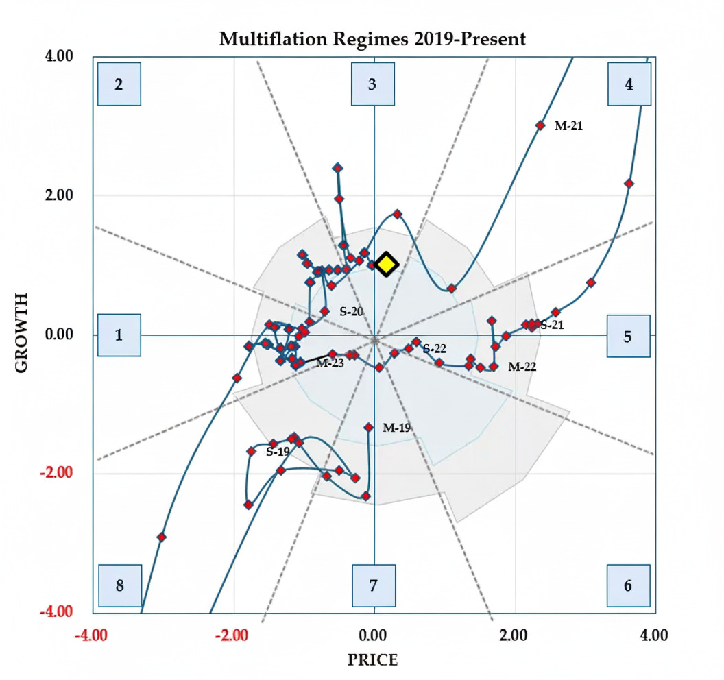
Understanding The Multiflation Map
Note: To understand how the Multiflation Map fits into our overall method, see our introductory piece Investing In The Age Of Multiflation (link here). If the Map seems complex at first glance, don’t worry—we’ll publish a detailed explainer shortly to walk you through how to read and interpret it.
The Multiflation Map distinguishes itself from most macro frameworks by revealing when conditions have truly diverged from recent norms—not merely whether growth or inflation is high or low, or whether either is rising or falling. This distinction matters because market behavior is shaped less by absolute levels or even rates of change than by departures from the familiar. The Map also captures private-sector health more clearly than consumer- and government-focused measures such as GDP.
We’ll share future map updates primarily on Twitter and Substack Notes rather than through email, so be sure to follow along there for the latest changes.
Twitter/X: @bewaterltd Website: bewaterltd.com
Not investment advice. For educational/informational purposes only. See Disclaimer.
Map Indicates Looming Stagflation
Our Multiflation Map reveals a fairly consistent pattern of real economic growth over the past year. Setting aside the brief Trump tariff spike in the spring, the economy has maintained a steady growth rate relative to recent norms, which keeps the economy near the same vertical position on the map.
More concerning is what’s occurring with prices. After a period of relatively modest price inflation, prices have begun to rise faster than recent norms. This acceleration pushes the economy rightward on the map, signaling that inflation is now running hotter than the baseline we’ve grown accustomed to.
The Map therefore shows a gradual clockwise rotation, signaling deteriorating conditions as we edge closer to stagflation.
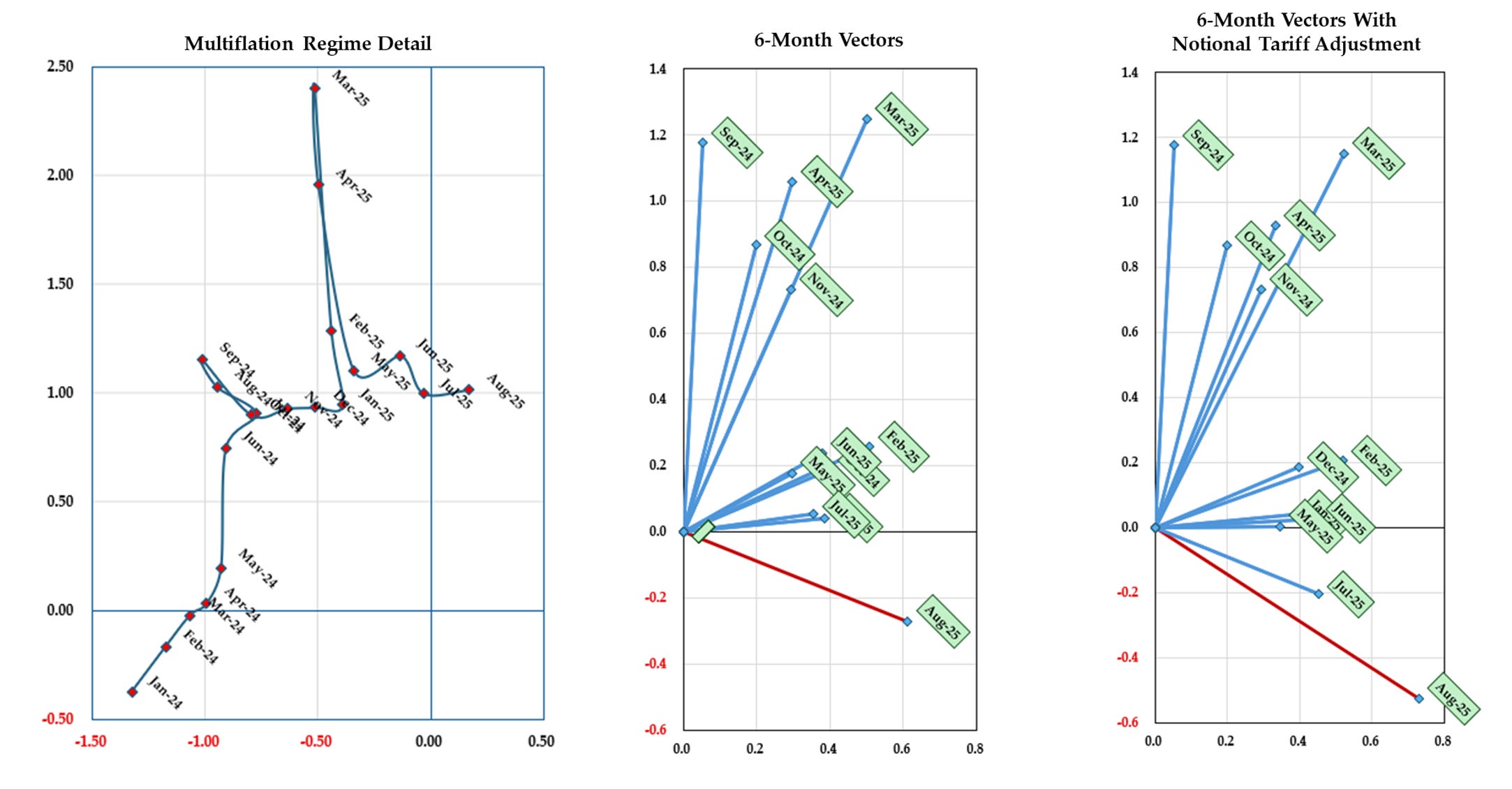
Trump’s Tariff Lottery Complicates Data
Analyzing the economy under Trump’s tariff regime presents a significant technical challenge. In Spring 2025, we saw temporary distortions as businesses rushed to import goods before Trump’s new tariffs took effect. The Spring import-wholesale surge will likely continue to distort our readings for at least a few more months before those data points age out of the comparison. By year end we should have a clearer picture of the underlying trends.
The price indices we use to separate nominal dollar sales into “real growth” versus “inflation” weren’t designed for this environment. These deflators either track domestic goods (such as PPI indices) or draw from import price data that explicitly exclude duties in their contribution to wholesale price calculations. Meanwhile, the actual sales figures businesses report increasingly reflect tariff burdens, according to most industry survey commentary.
This creates a measurement distortion. When tariff-inflated sales get adjusted using deflators that don’t account for those tariffs, we artificially understate the price component and overstate the real growth component. Correcting for this pushes our economic readings further into stagflationary territory—lower real growth, higher inflation.
The magnitude of this effect is substantial. Between February and September 2025, the Treasury collected $180.6 billion in border taxes, a staggering $115.9 billion more than the same period in 2024—an increase of 180%. Tariffs that represented roughly 3% of total goods imports last year have now jumped to nearly 8%, accounting for the modest growth in import volumes.
Since imports comprise about 10% of the sales categories in our economic model, this translates to approximately a 0.5% upward shift in measured prices and a corresponding 0.5% downward adjustment in real economic activity. This rough calculation doesn’t capture the full economic damage from supply chain delays, increased administrative burdens, reduced availability of certain goods, or the quality-price tradeoffs consumers face when forced to switch from preferred imported products to domestic alternatives that may cost more or work less well.
Investment Implications
We present these patterns as context rather than forecast; also note that stagflation has only one real precedent in our data—the 1970s—and the economy then bore little resemblance to today’s in terms of market valuations, structure, and conditions.
That said, based on historical patterns, we’d expect S&P 500 real returns to be reduced by approximately 6% over the next six months. Historically, energy companies, financials, and real estate would likely see the worst relative performance. Bonds—particularly at the longer end—would historically offset some of this relative underperformance, leaving the 60:40 portfolio earning 3.0-3.5% less.